
In my quest to learn Apache Spark to support my day job as a software developer, I decided to analyze my 2014 Tour Divide GPS data. Working with an interesting data set always helps the learning process. Plus, I had the possibility of finding some interesting statistics and measurements about the ride itself.
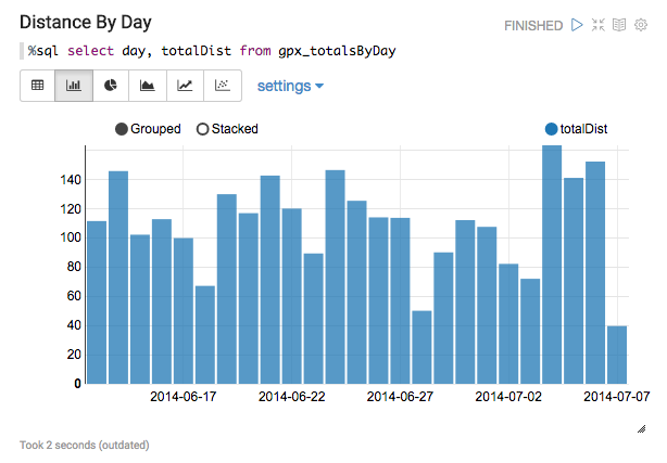
Daily Distance
I started with one of the most basic calculations about the ride – distance ridden per day.
Nothing too interesting here.
 Thing became a bit more “fun” when I threw in some standard deviation calculations. Standard deviation measures how much variance is in a set of values. The smaller the deviation, the closer the numbers.
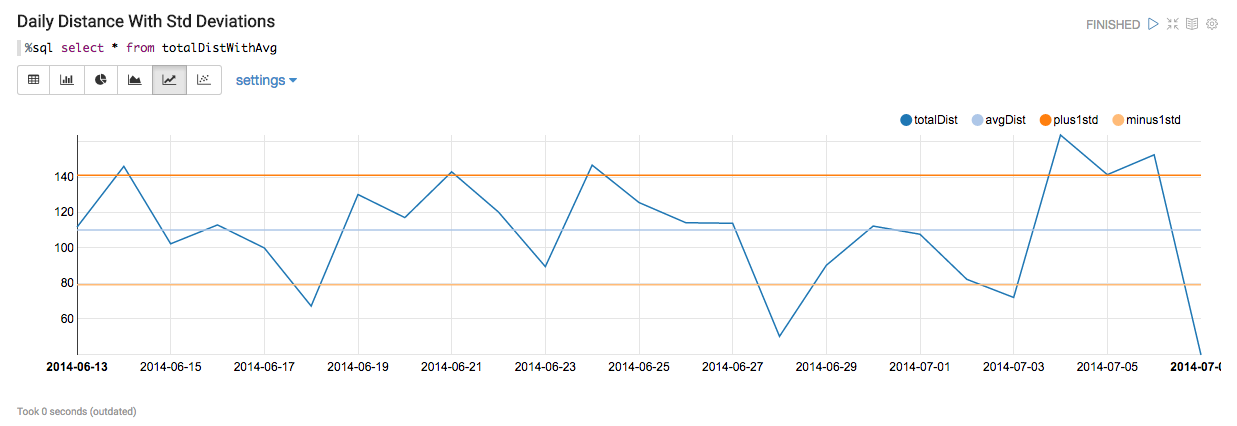
Click image for full size
The daily distances mostly fall within the orange lines which are one standard deviation above and one standard deviation below the average daily distance. In fact, 70% of the days fall within the +1 and -1 deviation which matches the expected normal distribution range.
In terms of the ride, what does this mean? I rode inconsistent mileage from day to day due to weather, physical ailments, and terrain. Even with a large number of variables impacting each day, the overall pattern of mileage fits a standard pattern of distribution.
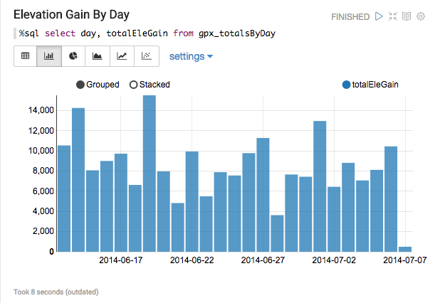
Elevation Gain
Unlike distance per day which is generally controlled by the rider, elevation gain by day is dictated by the terrain itself. Longer days can lead to more elevation gain if the route is in a mountainous area. That’s not always the case, so how do distance and elevation relate to each other? That’s a more interesting question than a simple elevation bar chart.
Correlation is a measure of how closely two data points are related. A value of 1.0 shows that the points are directly related – if one goes up, the other also goes up. A value of 0.0 shows that the data points are independent and do not move together.

Does more climbing result in less distance? Nope. With a correlation of 0.5, it’s not a close relationship. How about total distance vs. average speed? Even less correlation there. The variable that correlates the most with distance is duration. Or put another way, more time in the saddle equals longer distance days! There is no substitute for “butt in the saddle” time.
Weather Analysis
For me, this was the most interesting part of the analysis for two reasons:
1) I wanted to see if the weather of the first week was as bad as I remembered
2) From a data perspective, I allowed me to merge two datasets for better visualization.
The overall data was reduced to one data point per hour. For each GPS point, I used World Weather Online to retrieve the historical weather for that hour from the weather station closest to the point. Because the route strays so far away from towns, the closest weather station can be many miles away and at a much different elevation. So the weather analysis is a general approximation, not an exact measurement.
At least for the first week of the 2014 Tour Divide, the weather was the biggest obstacle. As shown in the overall weather map below, it was rain/snow until Helena, Montana. From there, it was almost all sunshine.
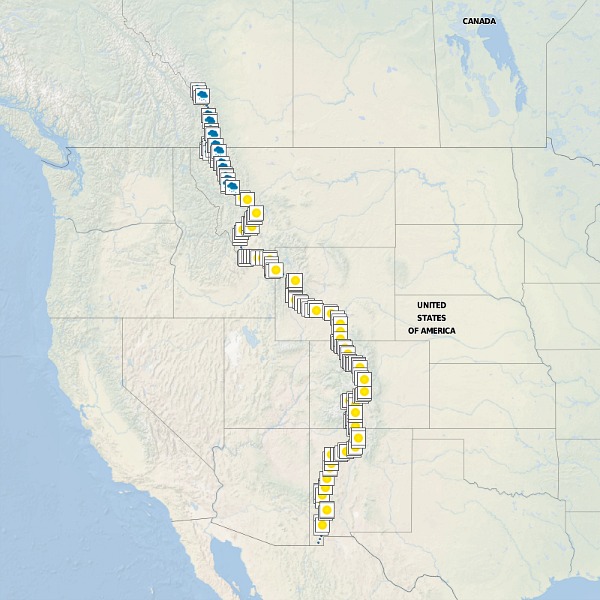
Overall Weather – it finally broke after reaching Helena, Montana
Zooming in further to show the hour by hour weather during the Canadian section.
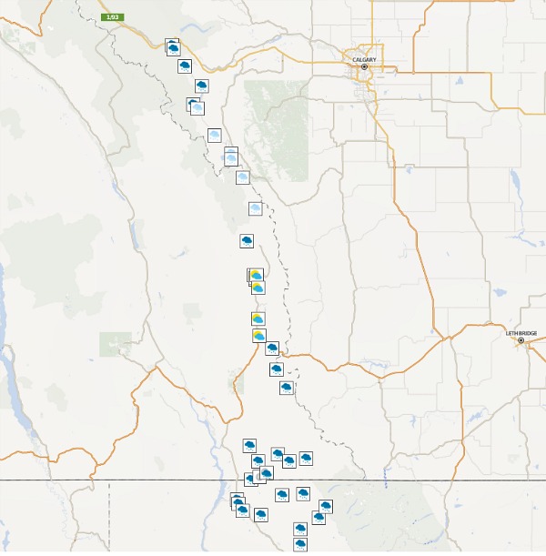
Canada weather
And Montana where the sunshine made it’s first appearance.

Montana weather
Wyoming with rain around Yellowstone
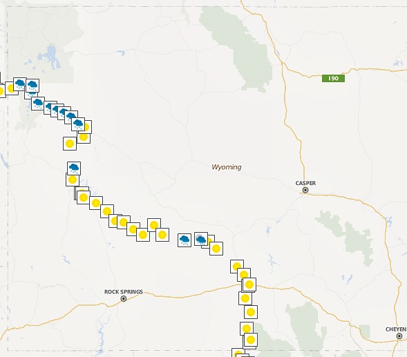
Wyoming weather
Colorado with lots of sunshine
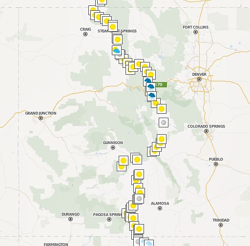
Colorado weather
And New Mexico with a lot more night riding
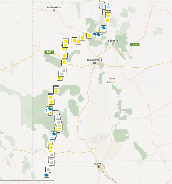
New Mexico weather
Conclusions
This became a fun experiment into the world of data science and barely scratched the surface on the analysis of GPS data.
The correlation numbers were an interesting discovery. I thought the elevation gain would correlate closer to distance because climbing goes so much slower than flat land riding.
I enjoyed the weather analysis from both a data perspective and a visual perspective. Seeing the weather icons plotted along the route brought the race back to life, and confirmed that the weather turned to sunshine as I reached Helena, some 600+ miles into the race.
Future analysis could include looking at the wind speed and direction during the race, or plotting proximity to towns using a color scale, or even plotting wildfires against the route.
PS – The Software Development Pieces
If anyone is interested in more details on the tech stack or obtaining the code used for the analysis, please let me know.
I used the following tools for parsing the GPS files, merging in the weather data and visualizing data: